Projects
Drift Settings Re-Design
Streamlining Information Architecture to Reduce Administrative Friction
Executive Summary
As part of Drift’s effort to improve product usability and self-serviceability, I led the redesign of Settings, a critical area where admins configure their workspace and team. The existing experience was disorganized, making it difficult for users to find key settings and causing a high volume of support tickets.
Over several months, I collaborated with product and engineering to audit the existing architecture, conduct user testing, and implement a more logical hierarchy. We focused on creating a scalable navigation system that could accommodate new features without overwhelming the user.
While the project faced constraints regarding legacy backend logic, we successfully reduced support tickets related to settings by 35% and increased the success rate of finding specific configurations by 17%. This project established a new design standard for Drift’s administrative tools.
"If something is off…I typically will wait until I’m on the call with [my CSM] and have him help me to make adjustments…because of my current role and my breadth of responsibilities, I don't have time to tinker. So if it's not exactly where I expect for it to be, I'm done."
As Drift evolved from a simple chat widget into a robust Revenue Acceleration Platform, its settings menu became a bottleneck—characterized by "feature bloat," fragmented navigation, and a lack of visual hierarchy that hindered administrative efficiency.
Based on continued customer feedback and a design audit, there are many parts of the Drift settings experience that feel disjointed, out-of-date, and/or inconsistent with current design patterns. Improving the discoverability and usability of settings, allows customers to take better advantage of Drift features and create their desired Drift experience.
Our high level goals were to:
Provide a settings experience that is simple to maintain and easy to onboard
Improve usability scores of settings tasks
Improve discoverability of more advanced settings features
As the lead designer, I implemented a user-centric overhaul focused on three pillars:
Information Architecture (IA) Restructuring: Regrouping dozens of disparate settings into logical, high-level categories (e.g., Personal, Team, and Organization) to reduce cognitive load.
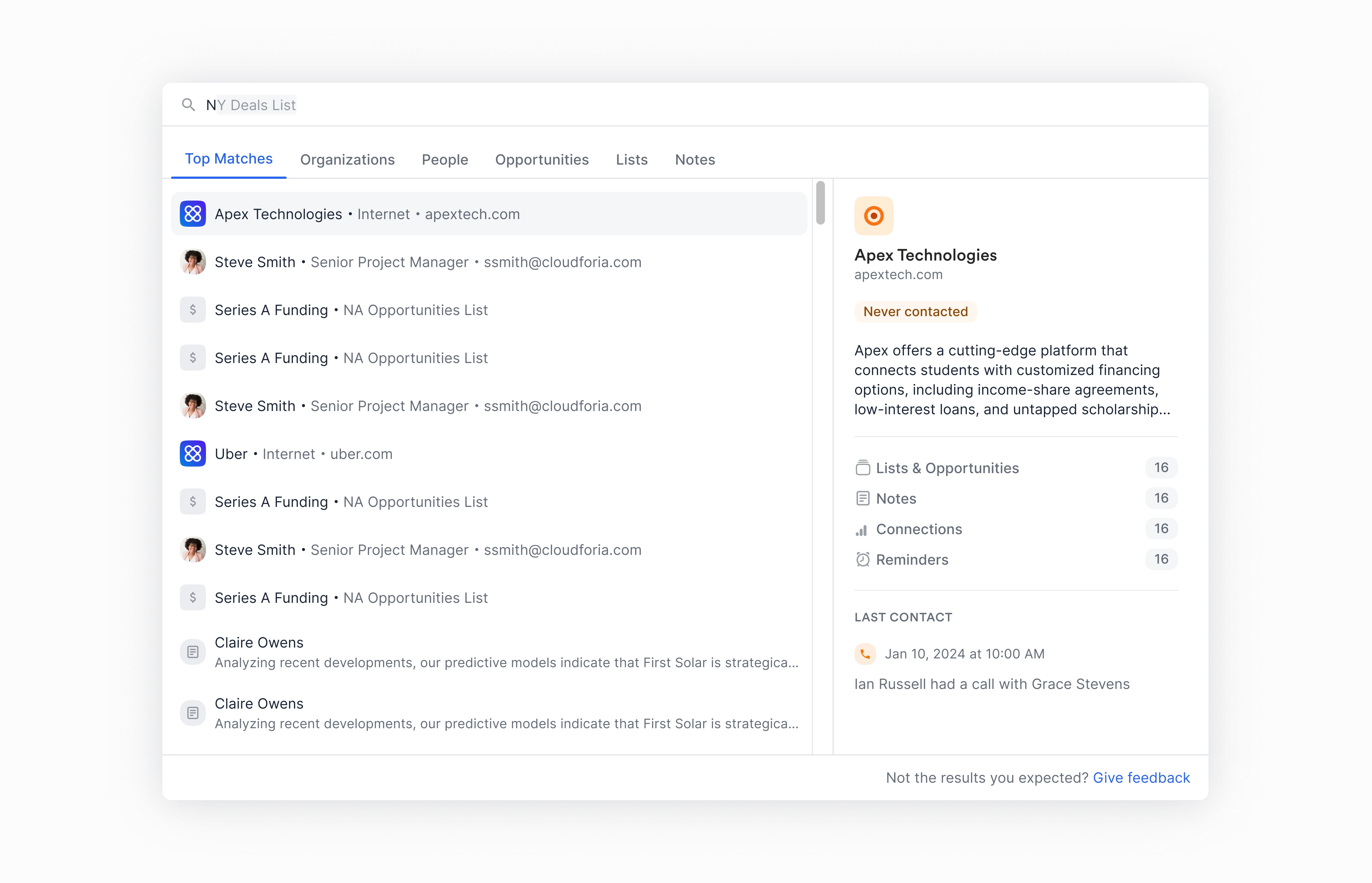
Global Navigation & Search: Introducing a persistent sidebar and a powerful "Quick Find" search utility to allow users to bypass deep nesting.
Visual Consistency: Standardizing input fields, toggles, and help documentation within the interface to create a unified "System of Record" feel.
The initial impetus for this project was to evaluate the current onboarding experience for premium to enterprise customers. Before a deep dive could be conducted, however, settings was identified as a larger issue affecting both the initial onboarding experience and the subsequent user experiences for admins. According to onboarding managers I interviewed ahead of this research study, settings can be one of the biggest blockers for users in initial setup. And making changes to settings often requires their input because customers don’t fully know where things are or don’t fully understand the feature.
To get a better understanding of the overall settings experience, I conducted an audit and identified some key issues:
Inconsistent UX Patterns
Components behaved inconsistently across pages and even sometimes on the same page.
Legacy UI pages
There were legacy UI pages that no longer fit our current visual standards/design system.

Local vs Global Settings
With Drift’s growth into new features there was a lack of distinction between a local vs global setting. For instance, Drift Video settings exist in its own environment separate from other settings objects which can create confusion for customers as they have to predict whether a setting exists locally or not

Scalability
The current UX did not scale efficiently for larger customers and advanced features were often hidden behind numerous clicks.

Baseline Testing
Based on the settings audit, I developed an initial hypothesis on potential improvements to settings that I would like to test out with customers through research.
Users want to be able to search for what they need in settings.
hypothesized that search functionality could help eliminate the need for customers to have a mental model of Drift that perfectly matches Drift. With search, users would have quick and easy access to find what they need without being Drift experts.
Users want one place to view all settings.
A more universal settings experience would create greater efficiency for initial setup and prevent users from blindly navigating the app. Furthermore, as Drift expands, there will be more cross-functionality and relationships that cannot be segregated into just one area.
Combining related areas will increase user efficiency and discoverability
To test out these assumptions, I had 9 customers and 3 internal CSMs complete a task completion exercise. For customers, they completed a series of tasks that spanned across the entire settings experience first within their current instance of Drift and then they tried to complete the same tasks within a prototype. For CSMs, because of their level of expertise within Drift, I only had them complete tasks within the prototype.
Task completion
30 min - tasks in current app experience
30 min - tasks in design mocks
Task completion
30 min - tasks in design mocks
Tasks focused on the following categories:
Drift Video
Account for the subsidiary applications that exist within Drift
Workforce Management
Most used admin tasks
Conversations
Settings for core features within Drift
I identified a failed attempt as one in which the customer was unable to complete the task after more than two tries. A partial success was identified as one in which the customer was able to complete the task on the second or third try or with some guidance from me.
Concept Testing
The second portion of the research, participants were asked to complete the same series of tasks in concept designs. I also tested search functionality and notifications within this series.
Drift Video
Account for the subsidiary applications that exist within Drift
Workforce Management
Most used admin tasks
Conversations
Settings for core features within Drift
Search
New search functionality for teammates and keywords
Originally 35%
Originally 17%
Overall, the main takeaways from both CSMs and customers centered around organization, copy, and guidance. Participants main confusion with the navigational structure of settings came from the inconsistent placement of items under these banners. As one participant mentioned, there seemed to be a clumsy distinction between these three that creates doubt and uncertainty for him and others.
Final iteration
Based on the internal and external feedback, I focused the final iteration on these 3 core areas:
Organization
Navigational breakdown into My, App, and Org settings works but is unclear because it’s inconsistent
Copy
Often copy played a role in creating more confusion, even within the first iteration
Guidance
Provide in-app guidance for users. Safety nets so they don’t have to get it right the first time
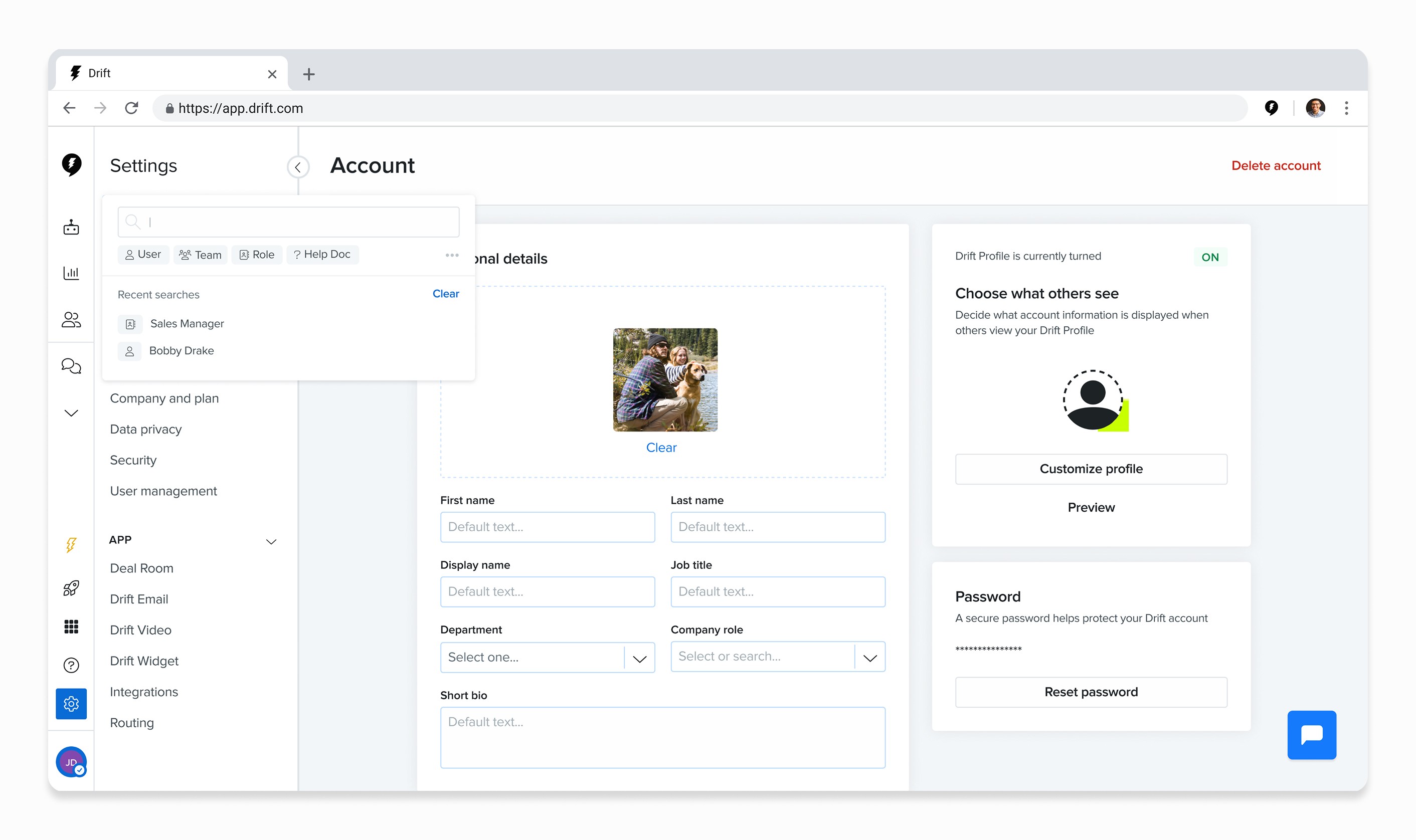
Upon initially landing into settings, I provided a simplified navigation that still centers around the original three main banners (App, Organization, and Personal settings). However, the sub-items have been reorganized to better align with participant feedback that the categories were inconsistent with the main label.
Before

After

Users want to be able to search settings
A universal settings experience made it easier for participants to find what they needed. This also acted as an easy safety net for users who didn’t know where to navigate for specific items.
Intelligent search functionality allowed users to filter searches by specified categories and included help docs relevant to keyword searches.
Users want one place to view all settings
Creating a universal settings experience removed user uncertainty about whether to navigate to settings or the object.
I also moved away from over-categorization of elements based on technical terminology. For instance, all settings related to the widget now exist under Conversations instead of separating items between ‘Bot,’ ‘Widget,’ and ‘Conversation’ settings.

Combining related areas will increase user efficiency and discoverability
Combining related pages also made it easier for users to navigate settings and decreased the potential learning curve for users who are not in the app on a frequent basis

What Came Next
Concept designs for the new settings experienced was shared with both my product team and company-wide. In communication with my PM and the engineering team, I have broken down these changes into individual chapters and prioritized them according to areas with greatest impact. From there, individual Jira tickets were created and placed within our backlog for the team to pickup as time allows. While settings is largely own by my product team, there are parts that are owned by others. As such, I have also prioritized features that are out of my team’s purview. Design DRI’s were assigned for these individual areas to be completed on their team’s timeline.
Impact
The redesign led to a measurable decrease in "How-to" support queries related to account setup. Key outcomes included a more intuitive onboarding flow for enterprise clients, improved discoverability of advanced features, and a scalable framework that allows Drift’s engineering team to ship new features without cluttering the user experience.
What We Learned
Advocating for the "Basics": I learned to proactively shape the roadmap by framing UX debt as a blocker to innovation. By demonstrating how a fragmented Settings experience slowed down feature adoption, I shifted the team’s focus from purely "building new" to "fixing the foundation."
Systems-Level Thinking: Moving beyond individual screens, I approached the redesign as a system-wide architecture problem. This ensured that the new navigation and brand management frameworks weren't just temporary patches, but scalable structures capable of supporting enterprise-level complexity.